Comparing Different Styles of Calligraphy: Western, Arabic, Japanese, and Chinese

Calligraphy is the art of beautiful writing, and many cultures have developed their own calligraphy types over the centuries. In this article, we will explore four major calligraphy traditions – Western, Arabic, Japanese, and Chinese – highlighting the unique characteristics of each style, their historical and cultural significance, and how they differ from one another. The aim is to provide an easy-to-understand comparison for readers, especially those interested in shodō (Japanese calligraphy).
Western Calligraphy
Western calligraphy refers to the art of decorative writing as practiced in the Western world, primarily using the Latin alphabet. It has a rich history spanning over 2000 years, with roots in ancient Roman writing and flourishing during the medieval period in Europe. Western calligraphy is characterized by stylized letters of the Latin script – from the elegant Roman capitals chiseled in stone to medieval manuscript scripts like uncial and Gothic blackletter, which feature bold, angular forms. Scribes in monasteries famously used these hand-lettered styles to create illuminated Bibles and manuscripts, often embellishing pages with ornate initial letters and gold leaf.
Western calligraphy evolved through the ages, reflecting changing aesthetics and tools. Early scribes wrote on papyrus and parchment with reed pens, later switching to feather quill pens as technology advanced. Even after the invention of the printing press, calligraphy continued to be used for important documents and books. There was a revival in the 19th century (during the Arts and Crafts movement) that renewed interest in this art.
In modern times, Western calligraphy survives as a beloved art form and hobby – seen in wedding invitations, logo designs, and decorative quotes. Letters are typically written separately (not connected, unlike cursive scripts in other traditions), and the focus is on consistent shapes and elegant strokes. Today one might learn Western calligraphy using broad-edge pens or pointed nibs to produce scripts like Italic or Copperplate. This style, while rooted in history, continues to captivate people with its balance of form and beauty.
Arabic Calligraphy
Arabic calligraphy is the artistic practice of handwriting based on the Arabic script. In the Islamic world, it is revered as the highest form of art, often called khatt (خط), meaning "line" or "design" in Arabic. Arabic calligraphy is immediately recognizable for its flowing cursive letters written from right to left. Each Arabic letter changes shape depending on its position in a word (initial, medial, final, or isolated), and letters connect, creating a harmonious, continuous stroke line. These features give Arabic writing a naturally cursive and decorative quality. Over time, calligraphers developed many styles (or scripts) of Arabic calligraphy, each with its own look.
For example, Kufic is the oldest style, known for its angular, blocky letters used in early Qur’ans. Later styles like Naskh and Thuluth introduced more curved, elegant lines, making the script increasingly cursive and complex. The cultural and spiritual significance of Arabic calligraphy is immense. Because Islamic tradition discouraged figurative images in religious contexts, writing itself became a major decorative art.
Verses from the Quran and pious phrases were turned into visual masterpieces adorning mosques, palaces, and manuscripts. Arabic calligraphy appears in architecture and design – from the soaring calligraphic inscriptions on mosque domes to the intricate geometric calligram compositions (sometimes forming shapes like birds or peacocks, as in the image above). This art form has been closely linked to religion, literature, and craftsmanship in the Arab-Islamic culture.
Calligraphers traditionally use a reed pen called a qalam dipped in ink to write on paper or parchment, mastering pressure and angle to produce thick and thin strokes. Arabic calligraphy balances readability with aesthetic form; sometimes letters are stretched or ornamented to create beautiful abstract patterns while still conveying words. Over centuries, it has remained a living art: not only preserved in classical texts but also evolving in modern graphics and digital design. Indeed, Arabic calligraphy continues to develop both in traditional contexts and in contemporary art and typography, demonstrating its enduring appeal and adaptability.
Japanese Calligraphy
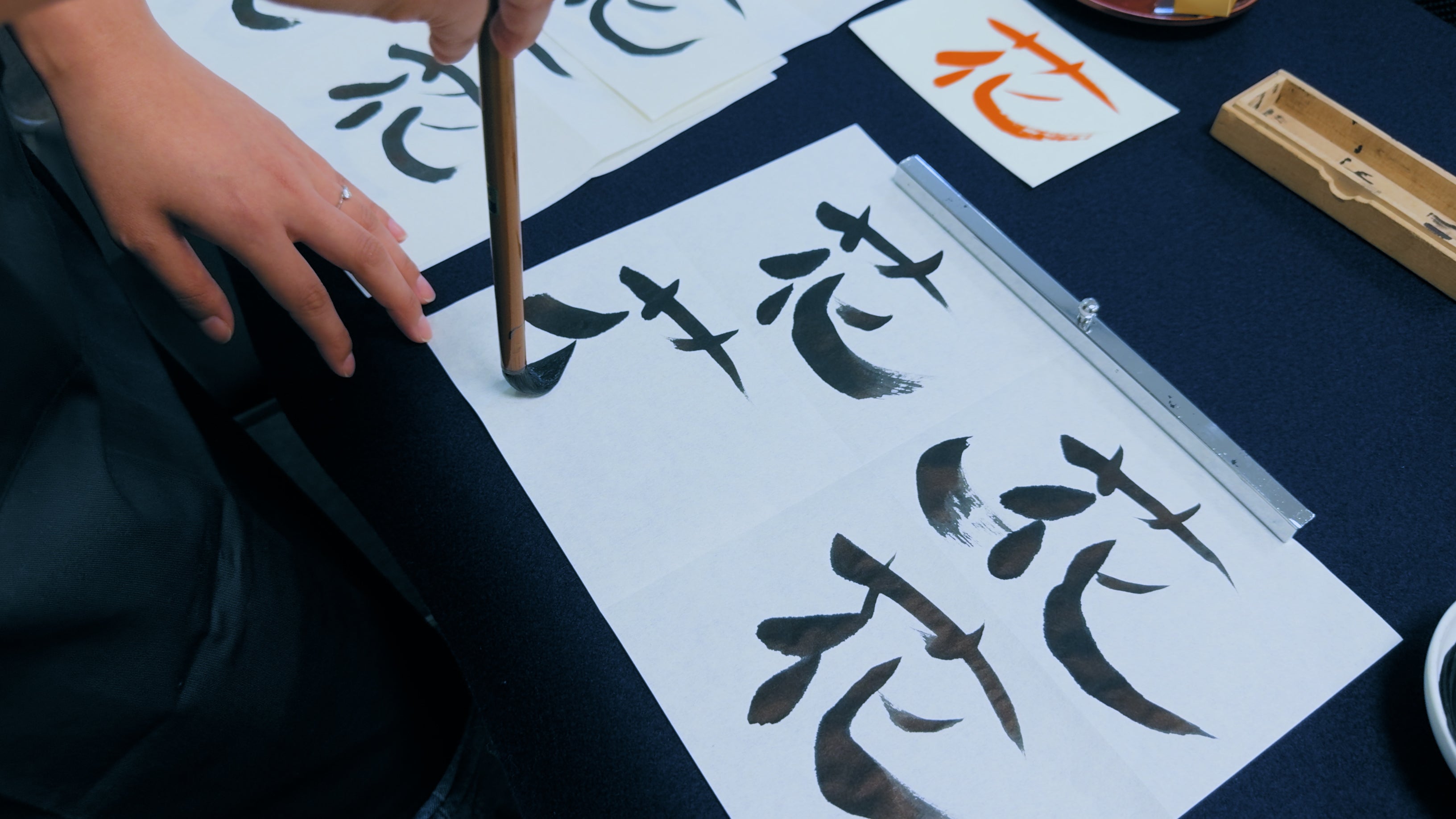
Japanese calligraphy, known as shodō (書道, “the way of writing”), is the art of beautiful writing in the Japanese language. This tradition was originally inspired by Chinese calligraphy – Chinese characters (Kanji) were introduced to Japan around the 6th century and used exclusively at first. Over time, as the Japanese developed their own phonetic scripts (the hiragana and katakana syllabaries), calligraphy in Japan evolved to incorporate these alongside Kanji, forming a uniquely Japanese style.
For example, a Japanese calligraphic work might combine Kanji (which carry meaning) with flowing hiragana characters (which indicate grammatical endings or native words). This blend of logographic and syllabic writing is a key distinguishing feature of Japanese calligraphy. Even when a piece is written entirely in Kanji, Japanese calligraphers often impart a certain aesthetic that can subtly differ from Chinese approaches – a result of centuries of developing their own artistic sensibilities (especially since the Kamakura period, when Japan’s calligraphy began to take on distinct Japanese characteristics).

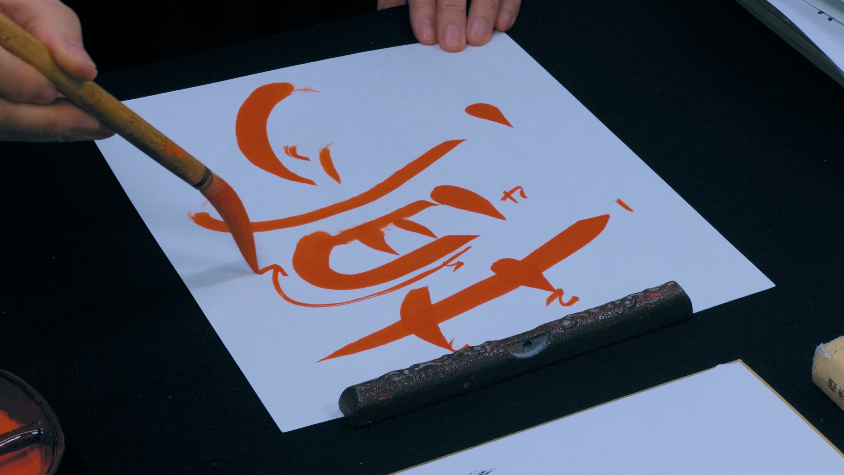
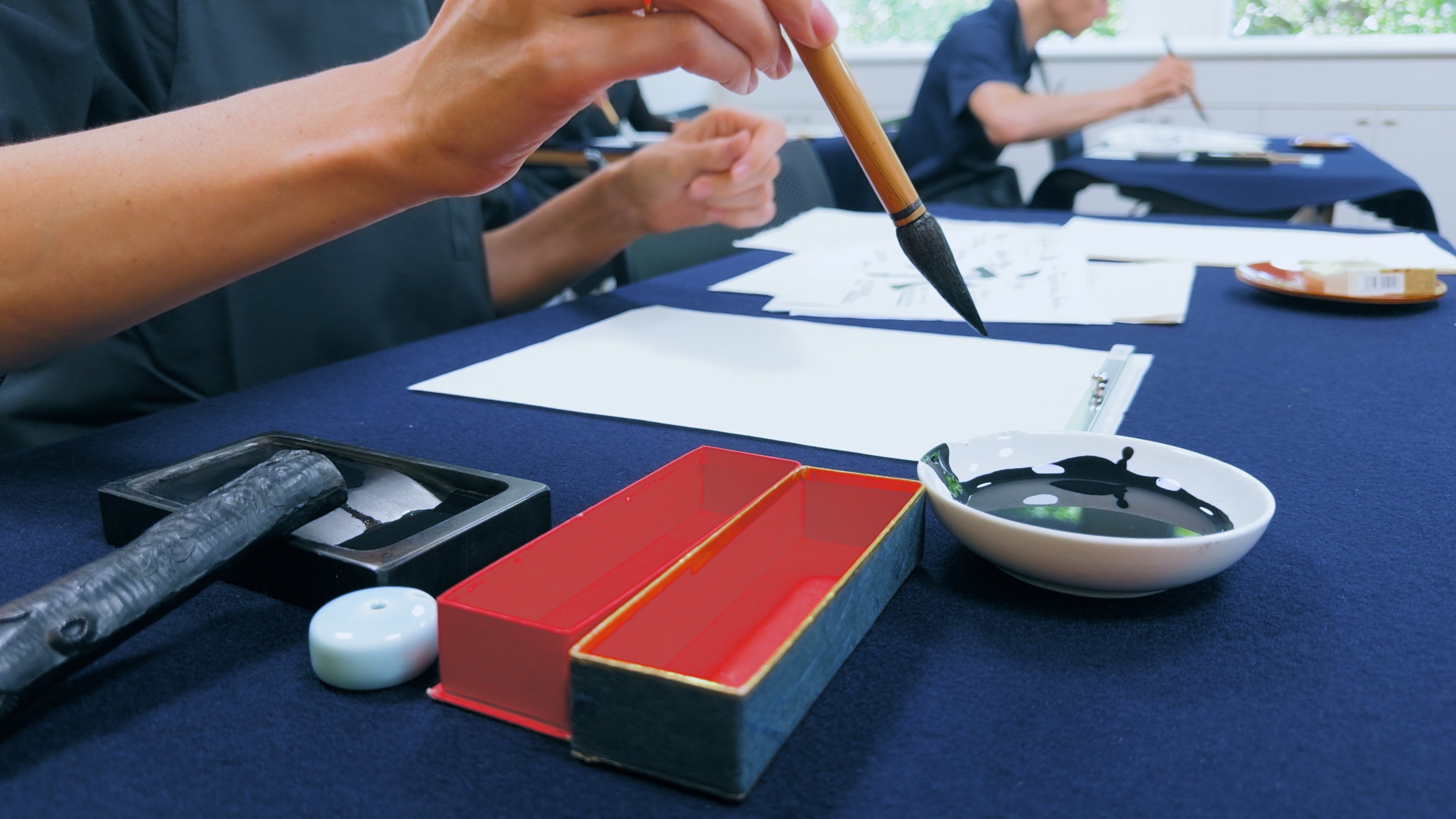
Japanese calligraphy is typically done with a brush (fude) and ink (usually black sumi ink) on rice paper. The calligrapher grinds an ink stick on an inkstone to produce the ink, embodying a meditative practice before writing. Strokes are made with swift, deliberate movements – shodō is as much about the motion and the state of mind of the artist as it is about the final product. In fact, Japanese calligraphy is deeply influenced by Zen Buddhist philosophy.
The act of writing is seen as a way to cultivate concentration, express spirit, and achieve a kind of harmony. The result is often minimalist and striking: a single character or poem written with bold, sweeping strokes that convey emotion and individuality. Culturally, shodō is highly respected in Japan. It’s such an important part of Japanese culture that it’s introduced to children in school from an early age– many students practice calligraphy in elementary classes to learn discipline, patience, and an appreciation for their writing system. Master calligraphers in Japan create works that are exhibited like paintings, and calligraphy performances (with large brushes on huge paper sheets) have become popular as well.
Japanese vs Chinese calligraphy can look similar at a glance (since Kanji and Chinese characters are essentially the same), but Japanese calligraphy often emphasizes simplicity and elegance, occasionally using the cursive kana letters that have no direct equivalent in Chinese, thereby setting its aesthetic apart. Overall, Japanese calligraphy is an engaging blend of imported tradition and indigenous innovation, valued both as a fine art and a form of cultural heritage.
Chinese Calligraphy
Chinese calligraphy is one of the oldest and most revered calligraphic traditions in the world. It is the writing of Chinese characters as an art form, combining visual beauty with the literal meaning of the words. In China, calligraphy (書法 shūfǎ) has been held in extremely high esteem for millennia – it was long considered the supreme art form, even above painting or sculpture, reflecting the deep importance of the written word in Chinese culture.
In ancient times, being a skilled calligrapher was a mark of scholarship and moral character; Chinese scholars (the literati) were expected to master calligraphy as one of the “Four Arts” of a cultured person. This esteem continues today, and Chinese calligraphy is practiced and admired not only in China but across East Asia.
The style of Chinese calligraphy is defined by elegant, expressive brushstrokes. Calligraphers use a soft brush made of animal hair and black ink, usually on white paper or silk. The interaction of brush, ink, and paper allows for a great range of line thickness and tonality – from sharp, light strokes to bold, wet ones – all in a single character. T
here are several classic script styles in Chinese calligraphy, developed over the long history of the Chinese writing system. For example, seal script (篆書 zhuànshū) has archaic, seal-like forms; clerical script (隷書 lìshū) features wide, sweeping strokes; regular script (楷書 kǎishū) is the standard printed form with clear, straight lines; and cursive script (草書 cǎoshū) is a highly stylized, flowing form where characters can be abbreviated beyond recognition. A skilled calligrapher can write in all these styles.
Regardless of the script, the act of writing Chinese calligraphy is often described as capturing the writer’s spirit or energy on the page – each stroke is an expression of movement and feeling. An old East Asian saying is, “Calligraphy reveals the person,” suggesting that the way one writes (the pressure, speed, and form of strokes) reflects one’s personality and cultivation.
Historically, Chinese calligraphy was not only a practical tool for communication but also a cornerstone of art – many calligraphic works by famous masters are treasured and displayed in museums like paintings. Indeed, looking at a piece of Chinese calligraphy, one might admire how the artist manipulated the brush to create living lines, where the rhythm and flow are almost musical. The influence of Chinese calligraphy has spread to neighboring countries (Japanese and Korean calligraphy stem from this tradition), making it a truly foundational art in East Asia.
Comparison of Calligraphy Styles
Each of these calligraphy traditions has unique qualities, but it’s insightful to compare their differences and similarities. Below is a summary of key differences between Western, Arabic, Japanese, and Chinese calligraphy:
- Writing Systems: Western calligraphy uses the Latin alphabet (as do other Western scripts like Greek or Cyrillic), meaning it consists of a fixed set of letters that represent sounds. Arabic calligraphy also uses an alphabet (28 letters) but in a cursive script where most letters connect. In contrast, Chinese and Japanese calligraphy use characters rather than alphabets. Chinese characters represent whole words or concepts, and there are thousands of them. Japanese writing includes those same Chinese characters (called kanji) and additionally two syllabic scripts (kana). This fundamental difference in writing systems shapes the art: a Western calligrapher focuses on 26 letters designed in various styles, while an East Asian calligrapher handles complex characters with many strokes. Notably, Japanese vs Chinese calligraphy highlights this difference – Japanese calligraphy may mix kanji and kana in one piece, whereas Chinese calligraphy uses only Han characters. The presence of curvy hiragana characters can give Japanese works a softer, kana flow that Chinese works (without kana) do not have.
- Direction and Form: Western calligraphy is typically written left-to-right (and top-to-bottom), with letters generally not connected (except in certain styles or when doing cursive penmanship). Arabic calligraphy is written right-to-left and inherently cursive – most letters in a word connect to the next, creating a flowing line. Chinese and Japanese calligraphy were traditionally written top-to-bottom and right-to-left in columns, but in modern usage they can also be written in horizontal lines (left-to-right for Japanese, either direction for Chinese depending on context). In East Asian calligraphy, each character is an independent visual unit, so they are typically written separately from each other (even when written in a line, the characters do not connect). This contrasts with the joined letters of Arabic words or the spaced-out letters of Western scripts. These directional and structural differences influence page layout and style: for example, a Western calligraphic page might have centered headings and justified text blocks, while a Chinese calligraphy hanging scroll often consists of vertical columns of characters with careful spacing for aesthetic balance.
-
Tools and Techniques: All calligraphy requires specialized tools, and the type of tool impacts the style of strokes. Western calligraphy traditionally uses a broad-edged pen or pointed pen (historically a reed pen or quill, and today often a metal nib pen) with ink. This produces strokes with varying thickness depending on pen angle and pressure – for instance, in italic script, certain strokes are thicker due to the broad nib’s orientation. Arabic calligraphers use a qalam, a pen made from a trimmed reed or bamboo, with a chiselled tip that creates both thick and thin lines. The qalam and special inks allow for the precise curves and dots of Arabic letters. In contrast, Chinese and Japanese calligraphy use the brush as the primary tool, along with ink made from soot (sumi ink). A soft brush can create very dynamic strokes – from fine hairlines to broad swaths – all in one stroke by varying pressure and speed. This gives East Asian calligraphy its characteristic lively, brush-painted quality. (It is said that Chinese calligraphy is closely related to ink wash painting, as they share tools and techniques.) The surfaces also differ: Western calligraphy is often done on parchment or paper that absorbs ink slowly, whereas Chinese/Japanese calligraphy is done on absorbent rice paper or silk, which requires confident strokes (you can’t easily revise a brushstroke on such paper). These tool differences mean that Western and Arabic calligraphy emphasize consistent, repeatable letterforms, while East Asian calligraphy emphasizes the expressiveness of each individual stroke.
- Aesthetics and Cultural Role: Culturally, calligraphy occupies different roles. In East Asia (China and Japan), calligraphy has been traditionally viewed as a fine art on par with painting – a way to visually convey the writer’s emotions and philosophy. A calligrapher’s personal style (how they balance the strokes, the rhythm of the writing) is highly valued as an expression of self. In China especially, calligraphy was considered a reflection of one’s inner character and cultivation. Japanese calligraphy is similarly tied to Zen and personal discipline. Arabic calligraphy, while also an art form, developed largely in service of the written Qur’an and religious decoration. Its aesthetics often aim to glorify the words of God – the lettering might form complex geometric patterns or decorative shapes, creating an awe-inspiring visual for holy texts and architecture. Thus, Arabic calligraphy is a central element of Islamic art, frequently seen in mosques, on coins, and in ceramic art, serving both beauty and spiritual purpose. Western calligraphy, historically used for illuminated manuscripts of the Bible and other texts, was certainly valued in medieval Europe, but over time it became less central to “high art” as painting and printing took precedence. In the modern West, calligraphy is enjoying renewed popularity but is often considered a craft or design skill more than a fine art (though many artists would disagree). Western calligraphic works tend to emphasize elegance and clarity and are commonly used in formal documents, certificates, or graphic design.
Conclusion
In summary, each calligraphy style – Western, Arabic, Japanese, and Chinese – has its own distinct beauty. Western calligraphy delights in the balance and form of letters, Arabic calligraphy excels in flowing symmetry and spiritual expression, Japanese calligraphy captures grace and spontaneous Zen-like movement, and Chinese calligraphy conveys dynamic energy and the artist’s inner state.
By understanding these unique characteristics and historical contexts, we appreciate how calligraphy, in any script, is more than just writing – it is a cultural art form that bridges language and visual art. Whether you are looking at a medieval Latin manuscript, an ornate Arabic prayer, a bold Japanese kanji, or an expressive Chinese character, you are witnessing the result of centuries of refinement, creativity, and reverence for the written word. Each tradition informs the other, yet maintains its own identity – and that is the beauty of calligraphy across the world.